Sunday, September 19, 2010

The Blog Lives

Hey, followers, if you've been following any of my blogs, particularly the one about the abstract flower, I want you all to know that I know it's been forever since I've blogged an update, I've just been too busy between school and track to spend time painting.

I'm taking advanced Chemistry classes for the first time, and they're a bitch.

I hope to paint again, and I'll update when I can, but for now, I remain idle.

Wednesday, September 1, 2010

Crazy Abstract Flower

In my last Blog post, "Suggestions?" I'd asked for suggestions on what to paint, as long as it was abstract, trippy, and relatively simple while including a picture example of the kind of thing I was talking about at the end of the blog.
Since I didn't get any real suggestions, only comments on the picture that I'd posted, I decided to paint that very picture in acrylic paint!


This is a beautifully colorful abstract piece of art, and very simple as it can be broken down into layers, each layer being a coat of paint and step in the process; this is how I will be painting this picture, and writing this blog!

Step One:
        ~Background Layer


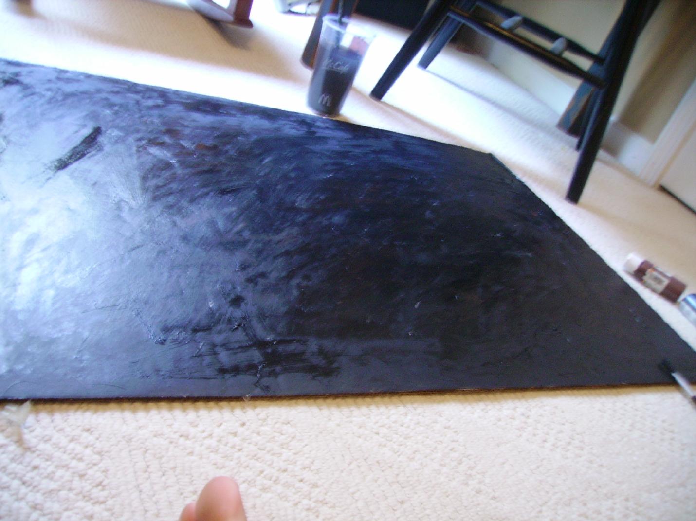
This layer is so simple, tons of black paint mixed with water and brown paint to soften it as in the model picture. Not really much to describe here; not much technique.

I started by squirting black paint all over the cardboard canvas, trying to reach each corner, then took my second largest brush (second only to the spongebrush) and scribbled and spread the black to an even consistent coat.
I squirted in some splashes of brown and spread it around to soften up the black, the way the background in my model is softened.


Here we see the evenly coated, black backing, but it isn't soft enough.
So now we dip our spongebrush in the water, squirt on some more brown, and brush over the whole thing a little more.


Almost theeeeeeeere......just spread that brown; make it look even.


Done!
The background layer is done!
Not hard, right? Well here comes the fun.


Step Two:
        ~Basic Shapes/Frames

For this step, we'll be having a little more fun and getting some more colors in.
The first colors we'll be using are white, orange, and yellow.
Start making the outline of the painting, the petals of the flower, if you will.


In the model picture, we have a lot of action, a lot of sporadic paint dots and it looks like a mess.
If we take all of that out, we just have the petals with their white frames, and the gradient transition of colors on the inside, that will be our next step after the framework is laid.


Now, I will be working more on this framework, because it's not done at all, and by extension, neither is step 2 of the painting process.
I HIGHLY recommend not adding any orange or yellow yet, that was almost a mistake of mine :/
You see in the pictures above and below that I've already started adding yellow and orange swirls up and around the white frame, before I've even started the gradients inside their frames!
I also need to make a lot more petals.

This was a mistake of mine, don't do it...YET!

Now, gonna stop painting for a while and give the painting a drying break!

~The REST of Part Two Coming Soon!~

Suggestions?

Hey guys, this post is pretty much about what the title says.

I'M TAKING SUGGESTIONS FOR MY NEXT PAINTING.

Now, you should know, I'm a pretty inexperienced painter so no elaborate scenes of busy parks, or complexly detailed portraits.

SIMPLE STUFF.
I like to paint trippy stuff. You know, abstract works.
Swirls and blotches of different colors making a sporadic pattern.

I trust the Blogger community.
Throw me some good ideas, Guys!


Monday, August 30, 2010

Splatter Painting Demo: A Quick Rasta

So today I decided to create something tangible and write a guide on some real painting, to get out of the habit of using computer paint software, like SAI and OpenCanvas.

I bought this sweet Bob Marley poster at Wal Mart today and decided to paint something Rasta themed :)


SplatterPaint Rasta Poster:
So I've had these big cardboard pieces intended for use as a canvas in my closet for a while now and haven't used any.
I'm partial to acrylic paints; I have a big Tupperware container full of them.


Now, I'd originally planned to write a review on different stroke techniques like taking a large brush and splitting the paint colors across the bristles, half by half, and create a piece like this, but I ended up making a big splatter art :)


Ok so I started off painting the mix shown above, blue and green on one brush, with big wide strokes, trying to make my own green. It ended up getting annoying and taking a little too much time so I dumped on some green and yellow, and red, and started painting the base colors for my poster.


From here, my mindset became, "Alright, let's thicken up this base layer with more paint, and give it some serious distortion.
I squirted the green, yellow, and red paint on in long lines and thick pools, and proceeded to spread the colors all around within their sections and just generally, as I've said, thickened up the base and added some subtle distortion by starting the splatters.


Now it was all a matter of adding different colors and splattering paint all over the place, but being careful not to just make a splattery, unidentifyable mess.
Squirt the paint on your fingertips and flick it onto the cardboard sporadically in short, controlled bursts; make NO pattern.
Splash in some black here and there for emphasis.


A little bit more here and there........aaaaaaaannnnndd.....DONE! STOP Splattering!
A HUUUGE part of splatter painting is knowing when to stop.
Don't just absentmindedly flick paint, more and more until your left with a gross mess; quit while you're ahead.

And it's totally up to the artist to know when to stop.
If it's any example, here's where I stopped:


It looks pretty simple and messy here.
I kinda rushed through it.
If I had to do anything different I'd not have smeared the yellow around as much. In the pictures you can see that it looks kind of ovular rather than having solid edges, and bear in mind that you don't want to have the edges looking too solid, but just not as ovular as I'd made mine.  

Sunday, August 29, 2010

SAI: Free Sketch Program

Ok, guys, this is my first blog post, and it's going to be about a little hidden jewel known as SAI.

It's a free sketching/painting program straight out of Japan and is comparable to Photoshop.
Download at:
http://www.systemax.jp/en/sai/

Ok, I'll just say it right now, if you don't own a tablet laptop, this program isn't really for you, but it's interesting nonetheless.

Ok:
When you open your newly install SAI, you'll have to open a new canvas by clicking new.
Set the dimensions to whatever you want, but for the sake of quality and for consistency, I usually put it to 1000x1000, or 1400x1400.

First off, when sketching, you mostly don't want to create a background. Usually sketching stuff doesn't require a background at all, just a white backing, so it's only more complex pieces that you might want to add a background, and keep in mind that you can always come back later and add a background.

Sketching:
If you've made a background, it's time to start a new layer and start your sketching!
Lock the background, hide it if you want, pick up tour pen tool, pick a non-inking color (like blue or green; NOT BLACK) and turn the density WAAAY down to like the 13-20 range.
Now, just sketch the outline of whatever it is you're drawing, don't worry about making a sloppy mess, you'll clean it up later!


Inking:
Now, add a new layer and leave the sketching layer visible, you'll be resketching it with a darker color now and a higher density and maybe a higher thickness (Black at 70-100 density; just turn up the thickness SLIGHTLY).
This step is pretty much the same as the last, but this time, you'll want to try to be more controlled in your sketching.
Go back over the other sketching, and thicken things.
WHEN YOU FINISH THIS STEP, grab that eraser and clean up the edges. Erase stray lines, shorten some strokes, just do house housecleaning, etc. etc.
Play around with the density levels of the eraser to give some edges a subtle faded look to them.


Detailing and Onwards:
Congratulations, you're done sketching, and you're almost 10% done!
That's right, but don't be overwhelmed, you've only laid the groundwork for your masterpiece.

Start with FLAT COLORS.

And then go back for shading and highlighting and blending colors.


From here on out, you'll be coloring, and simply playing around with colors, so start a new layer (and add more as you go along, MANY MORE, maybe a separate layer for for each color? Location of each color?) and begin experimenting with blending colors, highlights, tinting, etc; just play around, practice, and read some tutorials.

With time, devotion, and practice, you'll become a very skilled SAI artist.
GOOD LUCK!


Some Links, as promised:
http://xxlilevilangelxx.deviantart.com/art/PAINT-TOOL-SAI-TUTORIAL-1-65637187
http://algenpfleger.deviantart.com/art/SAI-Tutorial-67196095

Anything from:
http://www.drawfurry.com/?cat=6
Especially these two:
http://www.drawfurry.com/?p=112
http://www.drawfurry.com/?p=126